
My first impression of Estonia was the huge amount of contrasts. Starting from the Tallinn airport, you pass the industrial park, a village of multi-storey buildings, old soviet buildings surrounded by a forest of skyscrapers, all the way to the charming little Old Town enclosed in a centuries old stone wall. All these influences created and continue to form a unique place like Tallinn.
The same can be said about the natural ecosystem of Estonia – it is formed of a plurality of influences and species. This is clearly visible in the growing process of mushrooms. Their varied structures reflect the Estonian landscape marvellously. This discovery prompted me to take the mushrooms’ structures and translate them into letterpress print.
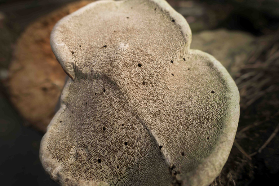
By setting the light to a low angle, I tried to capture the manifold structure of a mushroom. The aim was to reproduce the mushroom’s structure with all its natural quirks and irregularities, and to keep these prominent during the subsequent editing process.
The design file meant for letterpress must be in black and white if you want to print from a photopolymer cliché. The question then is, how do you print a grayscale image in letterpress? You need to turn the different hues of grey into spots of black ink. I tried six different kinds of grids on a test sheet to see how each of them behaves during the process of producing the cliché and printing on handmade paper.
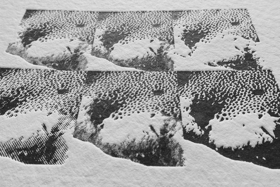
I decided to use a stochastic grid to preserve as many details as possible. This method worked very well with a variable pattern of dots. The darker the image area was, the higher the quantity of dots in this area. The dots were placed randomly, resulting into the very opposite of an orderly grid, which is usually used. To create this irregular pattern, I chose the DiffusionDither method when converting the image to bitmap. I raised the level to 500 pixel per inch.
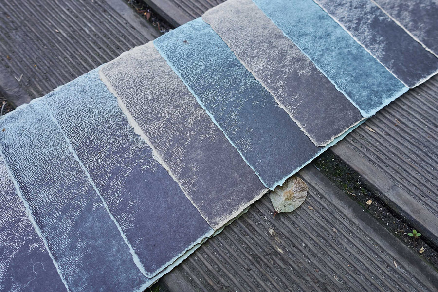
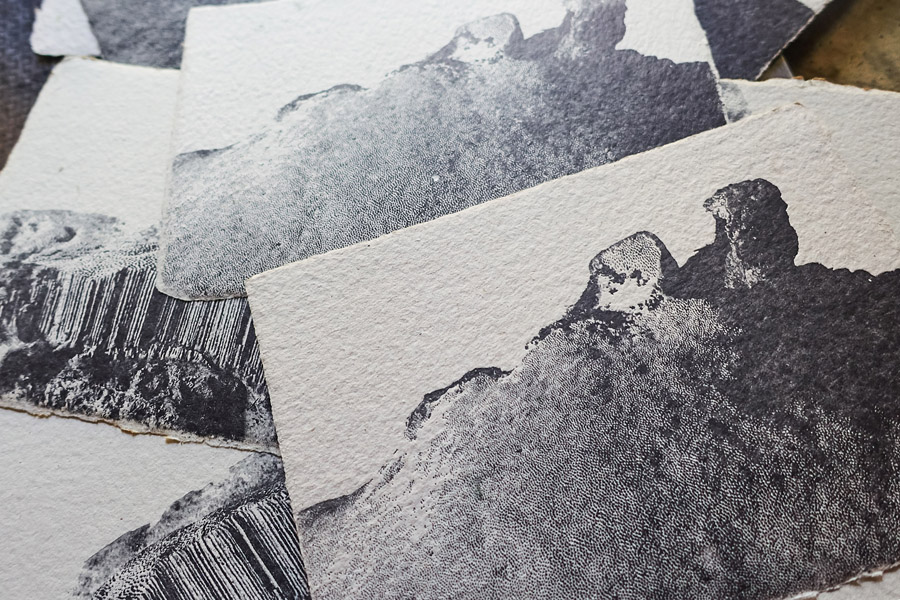
The test prints (as shown above) showed that the light areas of the design, if placed on the edge, easily break off when washing out the cliché after exposing the photopolymer. To avoid this, I decided to manually add colour to the too light area of the image before converting it to bitmap. This worked pretty well, although some parts still broke off. Nevertheless, the design allowed for these “imperfections”, and the resulting prints look good. Especially on the voluminous handmade paper, which allows a deep imprint to reinforce the mushroom structure with all its little quirks.
Written by Anna