Are you ready to prepare your own design to print in our Labora Workshops? Printing with letterpress has its specifics, so have a look at our recommendations before you start.
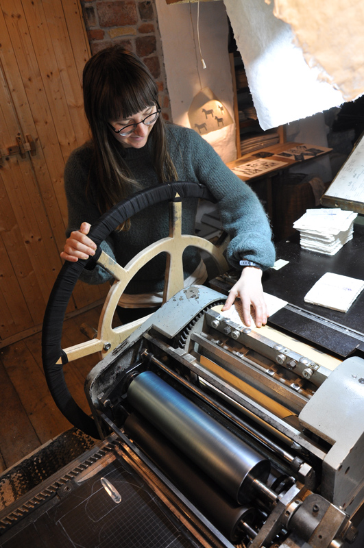
If you want to know how printing with letterpress works, read our printmaker Hannah’s article.
Colours
No matter how many and which colours you choose for your design, the files you send us must be black and white. And by black we mean the blackest black you can get: C-75 M-68 Y-67 K-90. Or simply drag the colour picker to the bottom left corner of the colour square.
If you want to print in more than one colour, each colour needs its own separate file, which covers the parts of the design printed in that colour. Why? When printing with letterpress, we develop a separate printing plate for each colour. We put ink on the rollers and print the full edition of prints in the first colour. After that we wash the rollers, change the printing plate, put on the second colour and print the full edition again. And so on, depending on how many colours you choose.
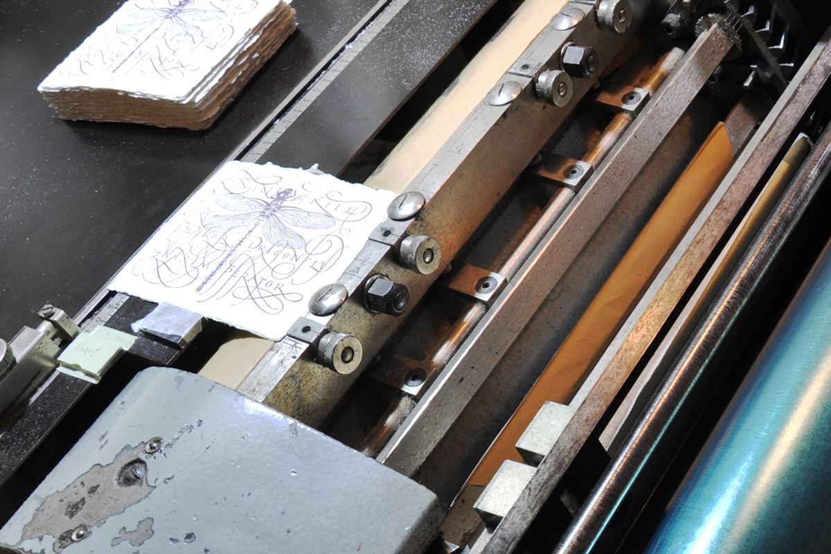
To make sure everything matches up as it should, you need to add cropmarks in the exact same position in every file you prepare, for each separate colour of your design. Even if the print is only in one colour, add the cropmarks so that we know where to place it on the format.
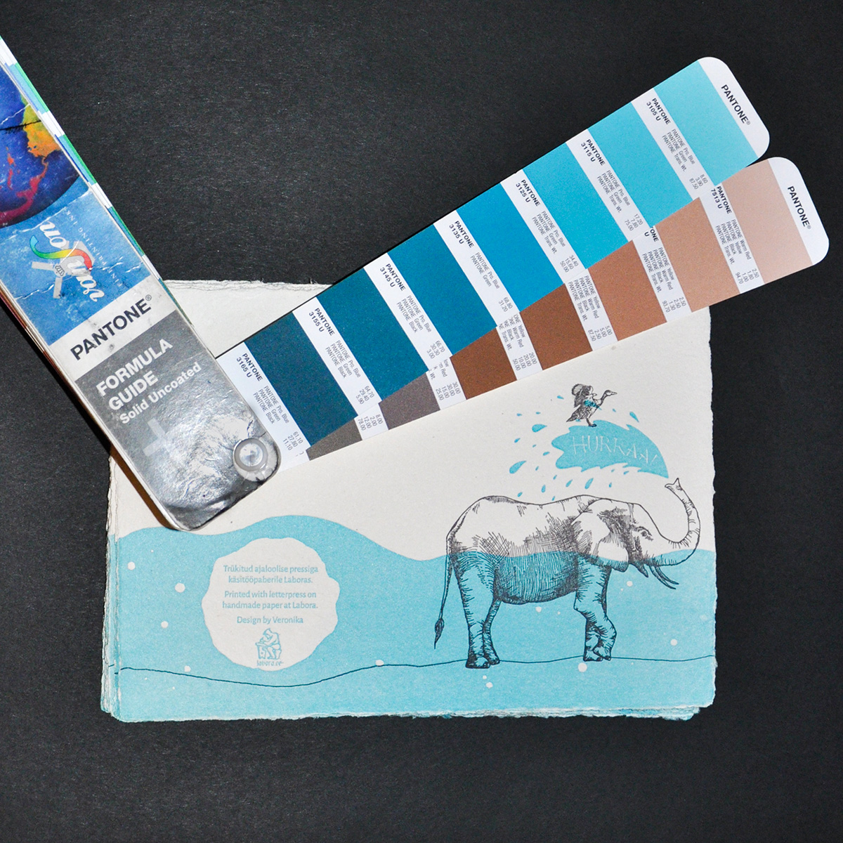
We use uncoated Pantone colours – choose the one you like the most and send us the code (ending with a “U”). Every screen shows colours a bit differently, so if you want an exact match, get your hands on a print Pantone Colour Guide. Or stop by our printing workshop to pick from ours.
Format
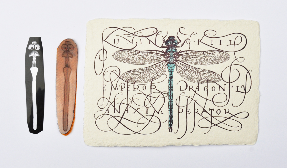
To achieve crisp lines when printing, prepare your design as a vector file. Trace the letters in case we don’t have the font you’ve used – or send it to us along with the file.
If your design makes it impossible to work in vector (e.g. our calligraphy designs are sometimes too fine and complex to be easily convertible to vector), scan your image at 1200 dpi. (600 dpi is the minimum, however – the higher, the better.) The format you want to scan it in is TIFF. When scanned, save the file using LZW compression – it will lighten up the file significantly and make it easier to work with. The next step is to adjust it to be black and white with no gray involved. The easiest way is to use the “Convert to bitmap” command with the “50% threshold” option. If you lose too much detail using this method, use the Levels bar to adjust the image first.
Save the design in the correct size, with cropmarks, as a PDF.
Margins
Leave 1 cm of free space on one of the margins. This is meant for the printing machine’s grippers which hold the paper while printing. A trick we like to use when printing in more colours: The margins can appear on different sides of the paper for each colour. That way you might be able to avoid an unwanted blank space.
Line width
This one is tricky. The thinner the line, the higher the probability that it will break or wash out (= disappear) while preparing the printing plate. Which means we will have to redo the digital design before redoing the printing plate, which can easily postpone your order by a day.
What will definitely wash out are stand-alone dots or long thin lines. Lines thinner than 3 px will most likely wash out. However, it depends on the design – if in doubt, send us your design for review even if it’s only half done.
As a rule of thumb, don’t use smaller font size than Arial 10 pt or Times New Roman 12 pt. If the dots above the “i” are hardly visible, you might want to manually enlarge them, less they wash out.
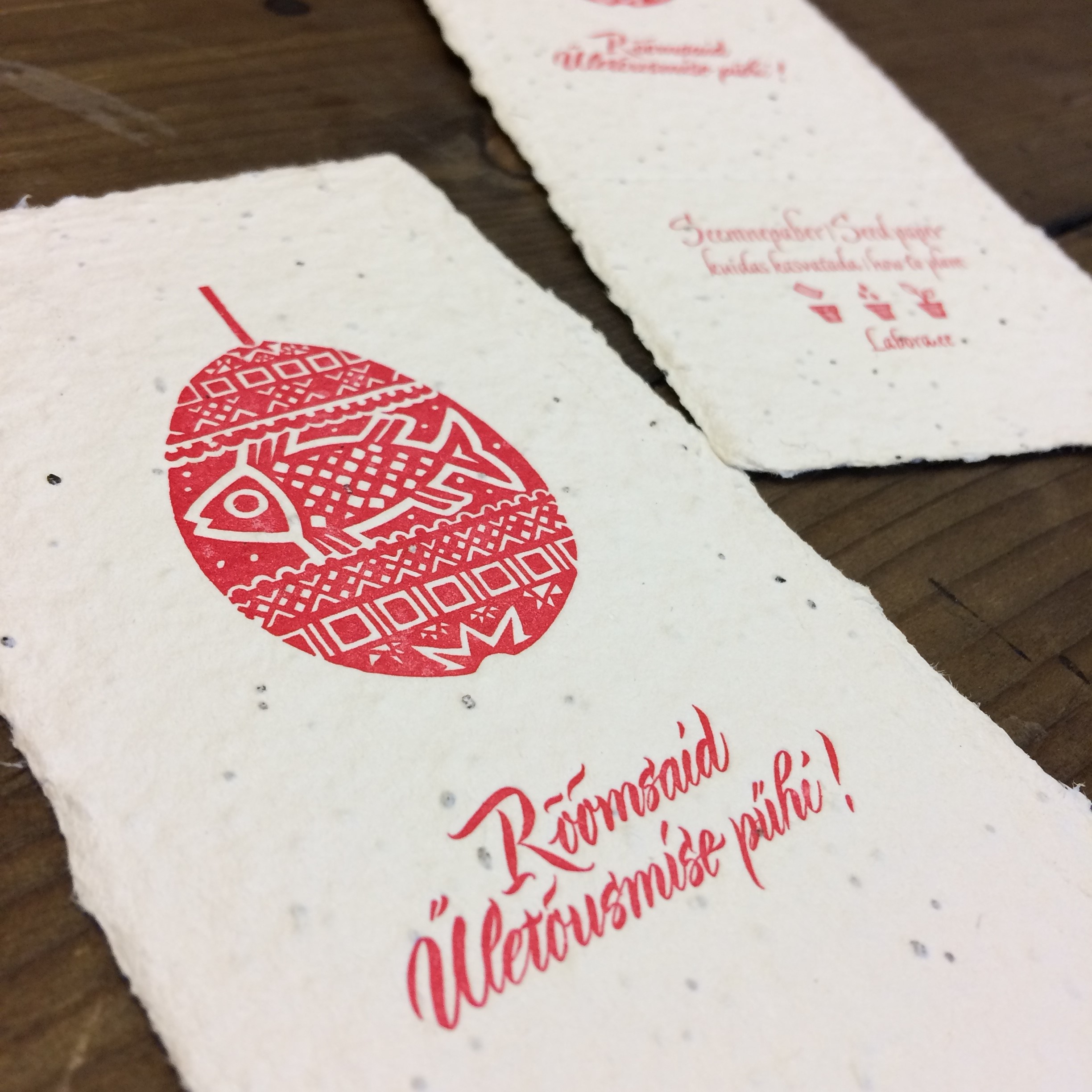
Seed Paper
Having flowers grow from your invitation or business card is a fun idea. To make it happen, you have to adjust your design to suit seed paper. This means leaving as much as possible of the seed paper’s surface print-free. For optimal growing results, the area of the print should not cover more than 40 % of the seed paper’s surface. If the print is double-sided, then the printed area must be positioned in the same place on both sides. We highly recommend keeping the design as light as possible, ideally using just 1 colour and printing on one side only.
Last Tip
Double check for mistakes and typos. Once a file is sent and approved for print, we are not responsible for any mistakes!